In today’s fast-paced digital world, navigating through websites can sometimes be a daunting task. With endless amounts of information and content available at our fingertips, finding what we need quickly and efficiently is crucial. This is where breadcrumbs come in.
Just like the trail of crumbs in the popular fairytale of Hansel and Gretel, website breadcrumbs act as a guide for users, helping them keep track of their location within a website and providing an easy way to navigate back to previous pages. In this article, we will explore the importance of breadcrumbs in web design and how they enhance user experience.
What are Breadcrumbs?
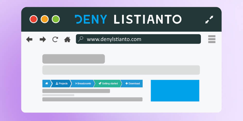
Breadcrumbs, also known as breadcrumb, trails or simply breadcrumbs, are a navigation aid commonly used in web design. They typically appear at the top of a webpage, just below the header, and provide links back to previous pages or categories visited by the user. Breadcrumbs usually consist of a series of hyperlinks, with the current page being the last link in the trail.

Breadcrumbs, also called breadcrumb trails or simply breadcrumbs, are a navigation tool frequently utilized in web design
The term “breadcrumbs” originated from the fairytale of Hansel and Gretel, where the two children left a trail of breadcrumbs to find their way back home. Similarly, website breadcrumbs provide users with a visual clue of their current location within a website and allow them to backtrack to previous pages.
Types of Breadcrumbs
There are several types of breadcrumbs that can be used in web design, each with its own purpose and benefits. Let’s take a closer look at the four main types of breadcrumbs.

In web design, various types of breadcrumbs exist, each serving specific purposes and offering unique benefits
Location-based Breadcrumbs
As the name suggests, location-based breadcrumbs show the user’s location within a website’s hierarchy. This type of breadcrumb trail is most commonly used on e-commerce websites, where products are organized into categories and subcategories. For example, a breadcrumb trail for a clothing website may look like this: Home > Women > Tops > T-shirts.
Location-based breadcrumbs are useful for users who want to backtrack to a specific category or page within a website. It also gives a clear understanding of the website’s structure and helps users navigate more efficiently.
Attribute-based Breadcrumbs
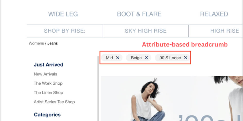
Attribute-based breadcrumbs show the attributes or filters applied by the user to reach the current page. This type of breadcrumb trail is commonly used on websites with a large number of products or content, such as online marketplaces or news websites.
For example, on an e-commerce website, if a user filters their search results to only show products under $50, the breadcrumb trail would look like this: Home > Category > Price Range > Under $50. This allows users to easily remove or change their filters without having to start over from the beginning.
History-based Breadcrumbs
History-based breadcrumbs, also known as path-based breadcrumbs, show the path the user has taken to reach the current page. This type of breadcrumb trail is commonly seen on websites with a linear flow, such as online courses or tutorials.
For example, on a cooking website, if a user is browsing a recipe for lasagna, the breadcrumb trail would show their previous steps in making the dish: Home > Recipes > Italian > Lasagna. This type of breadcrumb is useful for users who want to retrace their steps or refer to previous information.
Path-based Breadcrumbs
Path-based breadcrumbs, also known as attribute-based breadcrumbs, combine elements from location-based and attribute-based breadcrumbs. They show both the user’s location within a website’s hierarchy and the attributes they have applied to reach the current page.
For example, on a travel website, if a user is looking for flights to Paris, the breadcrumb trail would look like this: Home > Destinations > Europe > France > Paris. This allows users to easily navigate back to previous destinations and refine their search results.
Benefits of Using Breadcrumbs
Now that we understand what breadcrumbs are and the different types available, let’s take a look at the benefits of implementing them on your website.
Improved Navigation
The primary purpose of breadcrumbs is to improve website navigation. By providing a clear and organized trail of links, users can easily backtrack to previous pages or categories without having to use the back button or start over from the beginning.
Breadcrumbs are especially useful for websites with a large amount of content or products, making it easier for users to find what they are looking for. This can lead to higher user satisfaction and increased time spent on the website.
Reduced Number of Clicks
With breadcrumbs, users can easily go back to previous pages or categories without having to click the back button multiple times. This not only improves navigation but also reduces the number of clicks required, making the user experience more efficient.
When users are able to find what they need quickly and with fewer clicks, they are more likely to stay on the website longer and engage with the content or products offered.
Better User Experience
In today’s digital landscape, user experience is crucial in retaining and attracting customers. Breadcrumbs not only improve website navigation but also enhance the overall user experience.
By providing a clear and organized trail of links, users can easily find what they are looking for and feel more in control of their browsing experience. This can lead to increased trust in the website and ultimately result in higher conversion rates.
Higher Search Ranking
Implementing breadcrumbs on your website can also have a positive impact on your search ranking. Breadcrumbs provide additional internal links on each page, making it easier for search engines to crawl and index your website.
Furthermore, breadcrumbs also enhance the website’s structure and organization, which can be seen as a positive SEO signal by search engines. This can potentially improve your website’s visibility and ranking in search results.
Accessibility for All Users
Breadcrumbs are also beneficial for users with disabilities or those using assistive technologies. By providing a visual representation of the website’s hierarchy, users with visual impairments can easily understand the website’s structure and navigate through the content more efficiently.
Additionally, breadcrumbs can also benefit users with cognitive disabilities, as they provide a clear and organized way to backtrack to previous pages without having to remember the website’s architecture.
Best Practices for Implementing Breadcrumbs
While breadcrumbs offer numerous benefits, it is important to implement them correctly to ensure a positive user experience. Here are some best practices for implementing breadcrumbs on your website.
Consistent Placement
One of the key factors in effective breadcrumb implementation is consistent placement. Breadcrumbs should always be placed in the same location on every page to avoid confusion and make it easier for users to find them.
The most common placement for breadcrumbs is just below the header, either centered or aligned to the left. This ensures that users can easily locate them and use them to navigate through the website.
Descriptive Labels
The labels used in breadcrumbs should be descriptive and make sense to the user. Avoid using technical jargon or abbreviations that may be confusing.
Additionally, it is important to use keywords in your breadcrumb labels to improve their SEO value and help users understand the website’s content.
Visual Design
Breadcrumbs should be visually appealing and easy to read. Use a font that is easy to read and ensure that the text is large enough for all users to see.
It is also important to use a color or style that distinguishes the breadcrumbs from the rest of the content on the page, making them stand out and easily recognizable.
Mobile Responsiveness
With the increasing use of mobile devices, it is crucial to ensure that breadcrumbs are responsive and work seamlessly on all devices. This includes adjusting the size and placement of breadcrumbs on smaller screens and touch-friendly link sizes.
Breadcrumbs provide an efficient way for users to navigate through websites on their mobile devices, making it easier for them to find what they need without having to zoom in or use the back button.
Common Mistakes to Avoid when Using Breadcrumbs
While breadcrumbs can greatly enhance the user experience, there are some common mistakes that should be avoided when implementing them on your website.

Although breadcrumbs can significantly improve user experience, it’s important to avoid common mistakes associated with their implementation
Too Many Levels
One of the most common mistakes with breadcrumb implementation is having too many levels. Breadcrumbs should not have more than three levels, as this can overwhelm users and make the trail difficult to follow.
Having too many levels can also take up valuable space on the webpage and make it look cluttered. Stick to a maximum of three levels to keep the breadcrumb trail clear and concise.
Inaccurate or Inconsistent Links
Another mistake to avoid is having inaccurate or inconsistent links in your breadcrumb trail. The links should always be relevant to the current page and accurately reflect the user’s path.
In addition, make sure that the links stay consistent throughout the website. If a user clicks on a link in the breadcrumb trail and it takes them to a different page than expected, this can lead to frustration and a negative user experience.
Poorly Designed Breadcrumb Trail
The design of the breadcrumb trail is crucial in its effectiveness. If the trail is poorly designed or difficult to read, users may not be able to understand or use it effectively.
Avoid using small fonts, overly complicated designs, or colors that are difficult to read. Keep the breadcrumb trail simple and visually appealing for the best user experience.
Conclusion
In today’s digital landscape, website breadcrumbs have become an essential tool for enhancing navigation and improving user experience. By providing an easy and efficient way to backtrack to previous pages, breadcrumbs make it easier for users to find what they need and spend more time engaging with your website.
When implemented correctly, breadcrumbs can also have a positive impact on SEO, accessibility, and overall user satisfaction. Use the best practices and avoid common mistakes discussed in this article to ensure a successful breadcrumb experience for your users.


